
Making Adjustments
A personal history of pricing and modeling in the health insurance field
June/July 2016When I was an undergraduate majoring in mathematics and physical chemistry (lo, a long time ago), there was a requirement that we take a programming class—but not that we do much with it. I took my class, which was more of a language learning exercise than an effort to really understand data structure or the development of algorithms, and I enjoyed it. But then I went back to my comfort zone of matrices, differential equations and proofs.
I found I needed to pay rent, and for that a job as an actuary was my best bet. I learned from my mentors that actuarial work all started with a need to use the past to predict the future, and the past comes in the form of data and reports. My abstract education was a sufficient, although not excellent, preparation for actuarial exams. But for my daily chores of pricing and reserving work, I needed to spend a lot of time learning how to use a spreadsheet—a useful skill my theoretical background had neglected to develop.
My first job featured a terminal. The department programmed in a language called QuikJob, which was aged even then. There were COBOL, DOS and FORTRAN if we wanted to be adventurous. Actuaries dealt with hand coding and scheduled programming times. It was somewhat fun, but no one could say it was elegant.
Pricing and reserving work were straightforward. Reserve cells used factors, and perhaps a little bit of macro code in Lotus 1-2-3 to develop the factors. Judgment and estimates took care of the most recent months, and the work was done at a very high level. Of course, we exercised care, examined runout and had seasonal estimates. However, our data came from a routine mainframe report, and often we didn’t even get it electronically, but rather on green and white barred printouts, which we then had to enter manually into the model spreadsheets. This was time-consuming, and much of the attention was focused on not making errors, leaving little time for detailed analysis before the financial statements were due. It is hard to feel the glory of an advanced degree when you are doing 10 key. The amazing thing was not that we did it manually, but that the numbers were so good.
The modeling for pricing also was done with less detail than today, but senior actuaries applied some hard-earned insight to adjust history for bumps and diversions. Factors from national sources were incredibly important, and again there could be a lot of manual entry from factor sheets. I remember how exciting the advent of drop-down boxes and VLOOKUP was.
A Shifting Field
Many of the adjustments used now aren’t that different in nature from the ones we used then, although they are developed at a more granular level. For example, the adjustment value of a $5 copay change isn’t conceptually different from the actuarial value adjustments in the Affordable Care Act (ACA) models, although there is greater acknowledgement now that $5 to someone earning $24,000 per year is more significant than $50 to someone earning $125,000 per year. One of the most arcane and debatable sets of factors was the set of volume and complexity (V&C) factors used in the Health Care Finance Administration (HCFA) adjusted community rate (ACR) process. These were factors, at a very high level, meant to adjust commercial experience to the Medicare population, and although they had many significant figures, it is debatable if even the first digit applied well to some of the smaller population experience results (see Figure 1).
| Figure 1: Trends from a Morbidity and Mortality Weekly Report | |||
|---|---|---|---|
| Cost Category | Average Initial Rate (Percentage of Total) | Average Utilization Adjustment Factor | Average Projected Medicare Rate (Percentage of Total |
| Hospital inpatient services | $22.95 (36.0%) | 5.72 | $129.61 (50.0%) |
| Physician care | $25.58 (40.0%) | 2.90 | $75.44 (29.0%) |
| Hospital outpatient care | $4.01 (6.0%) | 2.99 | $13.61 (5.0%) |
| Skilled nursing facilities | $0.24 (0.4%) | 46.23 | $5.82 (2.0%) |
| HHA services | $0.30 (0.5%) | 20.08 | $3.65 (1.0%) |
| Laboratory services | $2.08 (3.0%) | 2.17 | $5.80 (2.0%) |
| X-ray | $2.18 (4.0%) | 2.19 | $6.78 (3.0%) |
| Emergency room | $1.68 (3.0%) | 2.34 | $4.92 (2.0%) |
| Miscellaneous medical | $4.38 (7.0%) | 5.00 | $15.00 (6.0%) |
| Total medical costs | $63.40 (100.0%) | 4.11 | $260.64 (100.0%) |
Source: Morbidity and Mortality Weekly Report
There were always some irritations when the actuarial and finance systems were separate. Pricing and modeling didn’t always agree, something no one enjoys remembering now. There were so many unanswered questions, especially in pricing. Incorporating information from publications and studies into the local framework was difficult. We knew inpatient services were shifting to outpatient settings, but by how much and how fast in one specific instance was hard to estimate. There was never enough information, time or resources.
Pricing at this high level was particularly scary because there were some seriously high trends during the 1990s and 2000s, when things like the HMO backlash were making pricing dicey.
An Influx of Data
You can imagine that trends like the ones in Figure 2 created an intense need for a better understanding of the drivers, which fueled a need for more data—but the data needed to be on an actuarial basis. This did not necessarily overlap with the institutional data processes, and actuarial questions were mired in lists of needed reports scheduled for completion later, usually during the “third quarter of next year.” There was nothing for actuaries to do but to construct actuarial databases and grow actuarial programmers, even though this meant there were often several sources of truth that did not always agree. We learned new terms: extract, transform, load (ETL); flat file in a CSV format; data dictionary. Once actuaries had their own data, they wanted to produce better, more sophisticated reports and models, which resulted in some actuaries becoming coders.
Figure 2: Average Health Benefit Cost per Employee Projected to Rise by Less
Than 5 Percent for the Fifth Straight Year
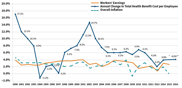
*The actual cost increase for 2015 will be available later this year
**Projected
Source: Mercer’s National Survey of Employer-Sponsored Health Plans; Bureau of Labor Statistics, Consumer Price Index, U.S.
City Average of Annual Inflation (April to April) 1990–2015; Bureau of Labor Statistics, Seasonally-Adjusted Data from the Current
Employment Statistics Survey (April to April) 1990–2015.
At first we produced descriptive reports, a lot like the ones that “actuarial” had received before, but with more detail and at a higher frequency. There would be dollars by month by service category, which would be divided by the member months to determine per member per month (PMPM) costs. The reserves matched the pricing exactly, because the same programs and systems produced both at the same time. Pricing models included estimates of how well the medical care provided to the population was managed, sometimes by specific service line. Provider reports improved, and it became possible to see how some providers had an outsized impact on overall cost structure. Spotting fraud often was based on serendipity or tip-offs. Our insight was better, but we had so much information we weren’t using, not to mention the growing need to price continual changes in coverage mandates for specific benefits.
So we learned to understand the components of claims and more new terms, like diagnosis-related group (DRG), Current Procedural Terminology (CPT), BillType, Revcode and Modifiers. We could analyze services at incredible detail. We thought about ICD-9 codes and whether they were present on admission (POA). Drugs were brand or generic, mail order or retail. The names of chronic diseases like chronic obstructive pulmonary disease (COPD) or end-stage renal disease (ESRD) became familiar, and the pricing models reflected the ability to address the care needs of these populations effectively. Actuaries spent more time with provider contractors, pharmacists and nurses. The needs for different analyses and the ability to do them made health actuaries, particularly the analytical ones, more specialized.
While all of this was happening, benefits became more complex, markets fractured, the technology of medicine burgeoned and new products emerged. Patient profiling was not just for the nurses doing care management, but it was needed to understand outliers, reinsurance, preferred provider arrangements and risk sharing. Risk adjustment was getting used more generally, enough so that the Society of Actuaries commissioned the first article comparing the different methods. Titled “A Comparative Analysis of Claims-based Methods of Health Risk Assessment for Commercial Populations,” the article, written by Robert B. Cumming, FSA, MAAA; David Knutson; Brian A. Cameron, FSA, MAAA; and Brian Derrick, was published in May of 2002. Although the principal inpatient diagnostic cost group (PIP-DCG) adjustment for Medicare+Choice came about in 2000, risk adjustment wasn’t used much in commercial pricing until later. We learned more new terms: relational database, query structure, hierarchical conditions, episode grouping, bundled payment and prospective adjustment.
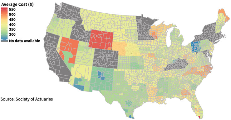
The health delivery system began to transform, and actuarial data analytics kept up. For a price, comprehensive, centrally-located data repositories were available, but in-house analytics still was a core function for actuarial departments. Data mining tools made things easier, and certainly the graphics and report outputs became more polished and colorful (see Figure 3). We needed to “bend the cost curve,” a phrase that entered the popular vocabulary in about 2008 and still describes much of what actuaries are trying to do with all of these models. There were more terms: accountable care organizations (ACOs), coordinated care organizations (CCOs), medical homes—all of which are not the same as HMOs, as many posts and blogs explain. Concepts like hot-spotting, in part thanks to Atul Gawande’s seminal article in 2011, and behavioral finance moved from non-actuarial disciplines into our pricing and forecast models. Data visualization made actuarial work even a little bit colorful.
Figure 3: Example of Data Visualization: Average Individual Premium Rates
Conclusion
Now the models are adding information from electronic medical records (EMRs), lab values, Twitter feeds and survey results—all data elements of a completely different sort than the types we have used in the past. We are awash with data, and there are exceptionally well-trained actuarial data scientists using sophisticated and powerful tools to make the most of it.
But with every additional data element, there are more opportunities to make an unintentional mistake. Differing data sources do not meld well together without a lot of oversight, and the results can be unexpected due to the butterfly effect. Using data at this detail and in this volume is an expensive undertaking, and often involves purchasing expensive tools or access.
The problem is that a lot of information means a lot of bad information without the comfort of the single source of truth, nor the comfort of “paid means paid,” which meant we had a cash financial statement number for a surety. With our fast and slick tools, we are at risk of being distracted by epiphenomena. As N. N. Taleb tells us, “Falsity grows faster than information.”1
And yet, Taleb also tells us to embrace the uncertainty and jump into the pool. The combination of tools, data and training has come together to form a complex, interconnected, transformative, swirling, exciting discipline. The best part about being an actuary is that we have both the technical ability to work with the most current data to create cutting-edge models, and the ability to adopt the long, wide view to put the model results into perspective. Or as Kurt Wrobel, FSA, MAAA, wrote recently, to adopt a wisdom-focused approach to using the past to predict the future.2 In the end, actuaries like you and me are doing predictive health analytics in our own way. Still.